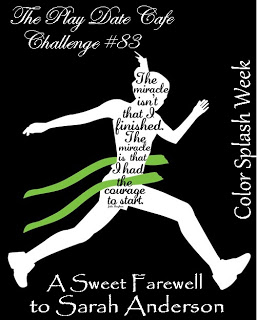
My first entry to PDCC. This week’s colors are black and white with a splash of green. One of my new favorite colors is this crisp apple green. In CTMH we call it Pear. I think it is my favorite stamp pad.
This is actually part of my Wedding Days series that was partially featured in Somerset Studio Gallery.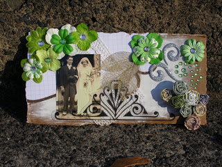


hi,
I'm Lori from Schuyler Relatives Of Arizona blog, I'm just curious as to why you decided to follow my blog–are you related to the family in any way ? Leave a message on my blog ok ?
Nice art work by the way.
Lori
LikeLike
What a cool assortment of embellies. I like the vintage feel of this pieces. Thanks so much for playing along with Color Splash at The Play Date Cafe.
LikeLike
Love it being called 'pear', sums it up perfectly! I love your project for our challenge, so very pretty! It's great to have you join us for the first time, hope you play along with us again at the Play Date Cafe!
LikeLike
So vintage like and pretty! Love those sprays of green flowers, they give such wonderful detail you your project! Thanks for playing along with us at the Play Date Cafe!
LikeLike
I love the collage feel to this. THanks a bunch for playing with us this week at The Cafe!
LikeLike
Beautiful embellishments…WOW!!! Thanks so much for joining us at The Play Date Cafe 🙂
LikeLike
thanks so much for the good wishes you left me on my blog! Love this tag 🙂
LikeLike
Beautiful layout
Barbara
LikeLike